UX research for the online store of Ukraine’s largest mobile operator, from survey to shipped changes.
Role
UX Designer, research only
Timeline
2023 · 4 months, side project
Methods
Desk research, survey (80), interviews (5), CJM
Impact
+30% starter pack purchases
Task
Generate and validate hypotheses that could increase purchases of prepaid packages (SIM cards) through the online store.
What I did
Competitor analysis, a survey of 80 people, 5 in-depth interviews and a customer journey map walked through with users. Then I prioritized the problems design could solve.
Result
+30%
starter pack purchases; awareness of buying online grew from 20% to 60%.
Competitor analysis
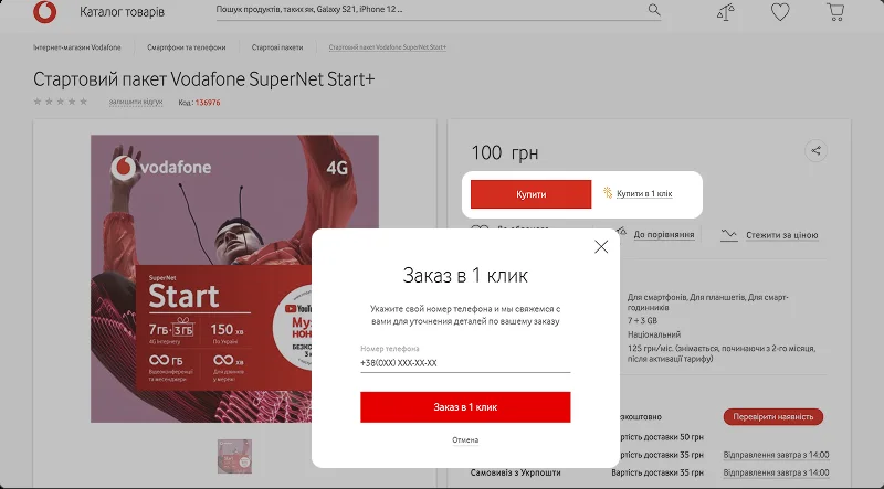
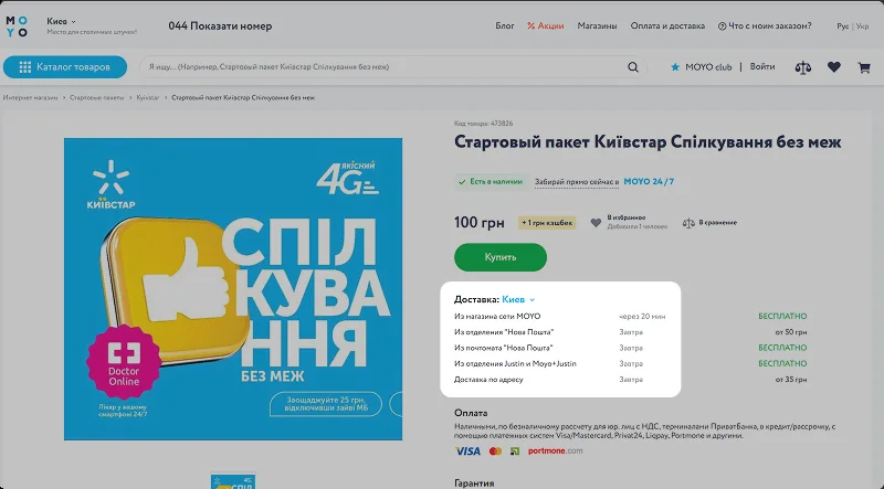
Vodafone, Orange and the retailer Moyo did some things better
We compared Kyivstar with the two other major Ukrainian operators and with Moyo, an electronics retailer that sells Kyivstar starter packs.
Vodafone: buy in one clickMoyo: several free shipping options
Survey and interviews
What 80 respondents and 5 interviews showed
90%
bought their starter pack more than 6 years ago. The audience may be young people getting their first phone.
80%
didn’t know about the online store or that a starter pack could be bought there.
2–3 days
of delivery caused frustration, even among people happy to pay for it.
“Why wait and queue at the post office if I can buy one offline on my way from the subway?”Interview participant
Customer journey map
Walking the purchase flow with users showed where it breaks
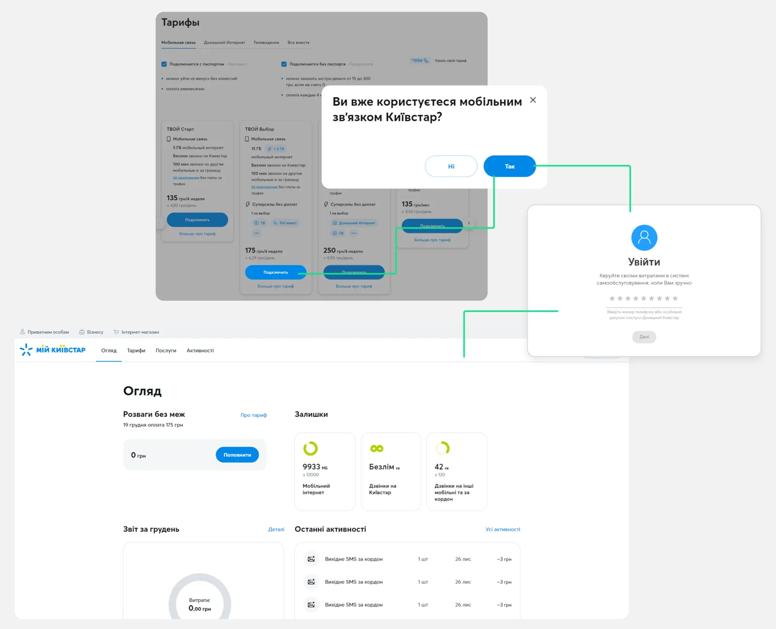
Lost in the personal account
Existing users who entered their number landed in their account instead of the chosen tariff.
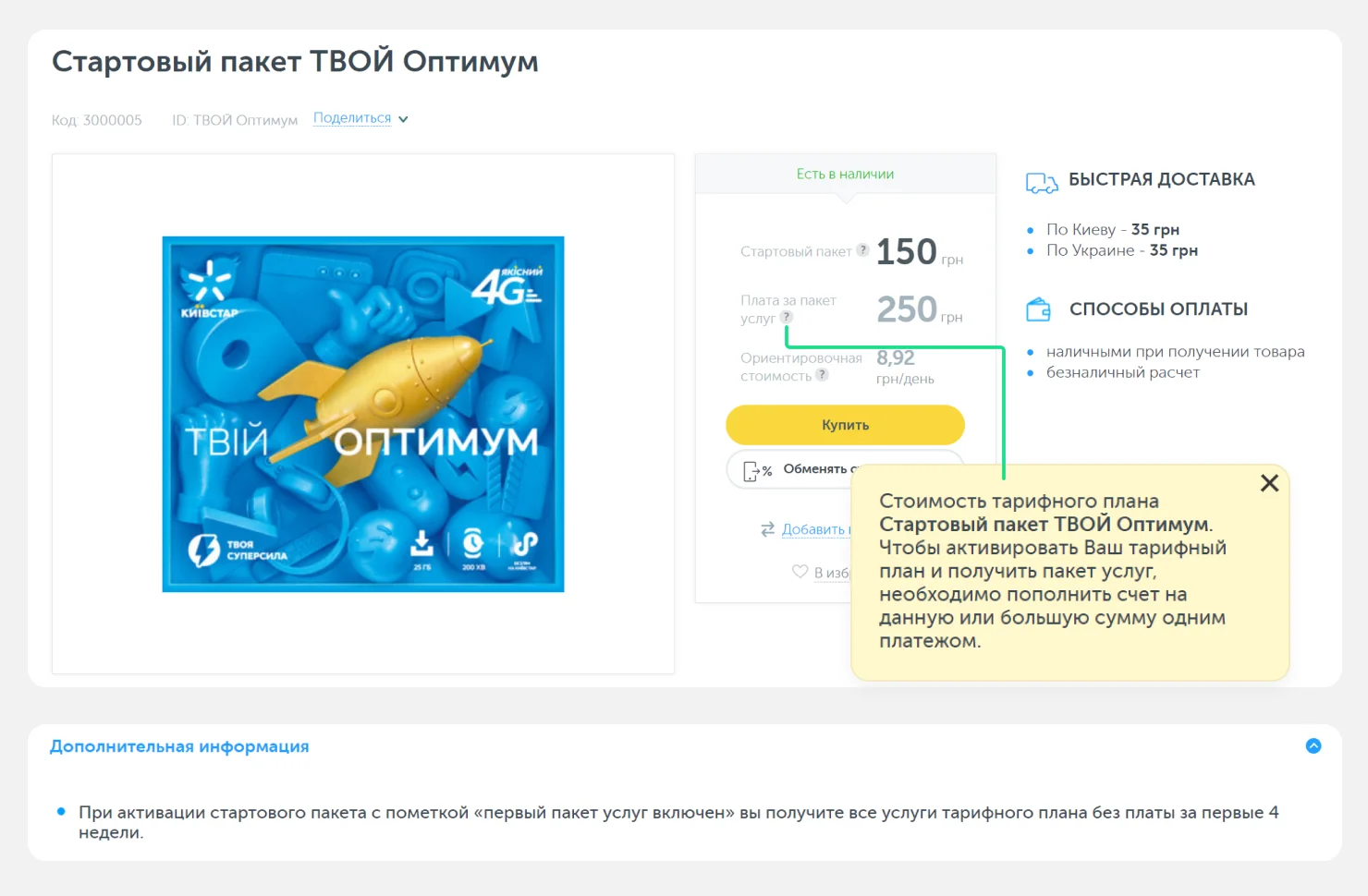
Confusing prices
The same tariff cost differently on the website and in the store, and three different texts explained the first month.
Slow checkout
Every field was filled in manually, and delivery took three business days.
“Connect” → sign-in → the personal account instead of the tariffConflicting messages about the first month
Priorities
Three problems to solve first
Chosen for their direct impact on online purchases and because design can change them. Awareness of the store was mostly a marketing task, so design focused on entry points.
Buying is too complicated
Choose a new SIM or an existing number; buy in one click; keep users on the tariffs tab.
Prices aren’t transparent
Show the pack price and tariff together; one clear message about the first month.
Delivery feels slow
Show the date and options upfront; offer faster ways to get a SIM.
Option we rejected
Make physical SIM delivery faster
Delivery was complex and largely depended on partners outside the team’s control.
What we chose and why
Recommend an online eSIM flow
An eSIM removes delivery altogether, and interviews showed users already leaned towards it.
What shipped
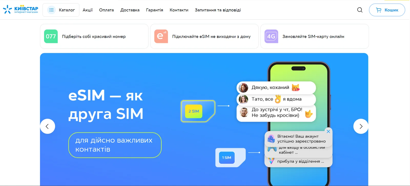
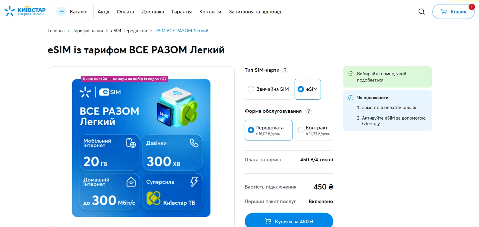
Entry points to the store and an eSIM in two steps
My role was the research: competitor analysis, the survey, interviews, the customer journey map, and prioritized recommendations. Based on them, Kyivstar’s team designed and launched visible shortcuts on the store’s home page and a product page where users choose a regular SIM or an eSIM, see the full price, pay and activate with a QR code. The marketing team ran an ad campaign at the same time.
Shortcuts: “Connect an eSIM without leaving home”, “Order a SIM card online”One page: SIM type, price, order, activate with a QR code
Results
The hypotheses were confirmed
+30%
starter pack purchases online
20 → 60%
people know they can buy a SIM online (repeat survey)
Next
help users choose a tariff “here and now” with a quiz and live help